Company Overview:
Moguess Energy is a professional electrical contracting company specializing in high-quality, innovative solutions within the energy sector. Their services focus on PV Solar Systems, Electrical Installations, and Security Systems.
Project Scope:
The objective was to create a cohesive brand identity for Moguess Energy that reflects their professional approach and specialization in the energy sector. This included designing:
A distinctive logo
Comprehensive brand stationery (business cards, letterheads, and email signatures)
A ten-page company profile highlighting the company’s offerings, services, and unique value proposition
Design Strategy:
Logo Design - The logo development for Moguess Energy was centered on capturing the essence of energy, innovation, and reliability. Here’s a breakdown of the key design elements:
Symbol : The light bulb icon with energy waves radiating from it symbolizes ideas, innovation, and illumination, which are essential in the energy and electrical industry.
Incorporated Iconography : Inside the light bulb, a minimalist “M” shape which represents Moguess, providing a direct visual connection to the brand’s name.
Colour Choice : The yellow colour reflects energy, optimism, & clarity, conveying a sense of positive energy & expertise.
Typography : The custom font style emphasizes modernity and professionalism, projecting a sleek & contemporary image suitable for a technology-driven company.
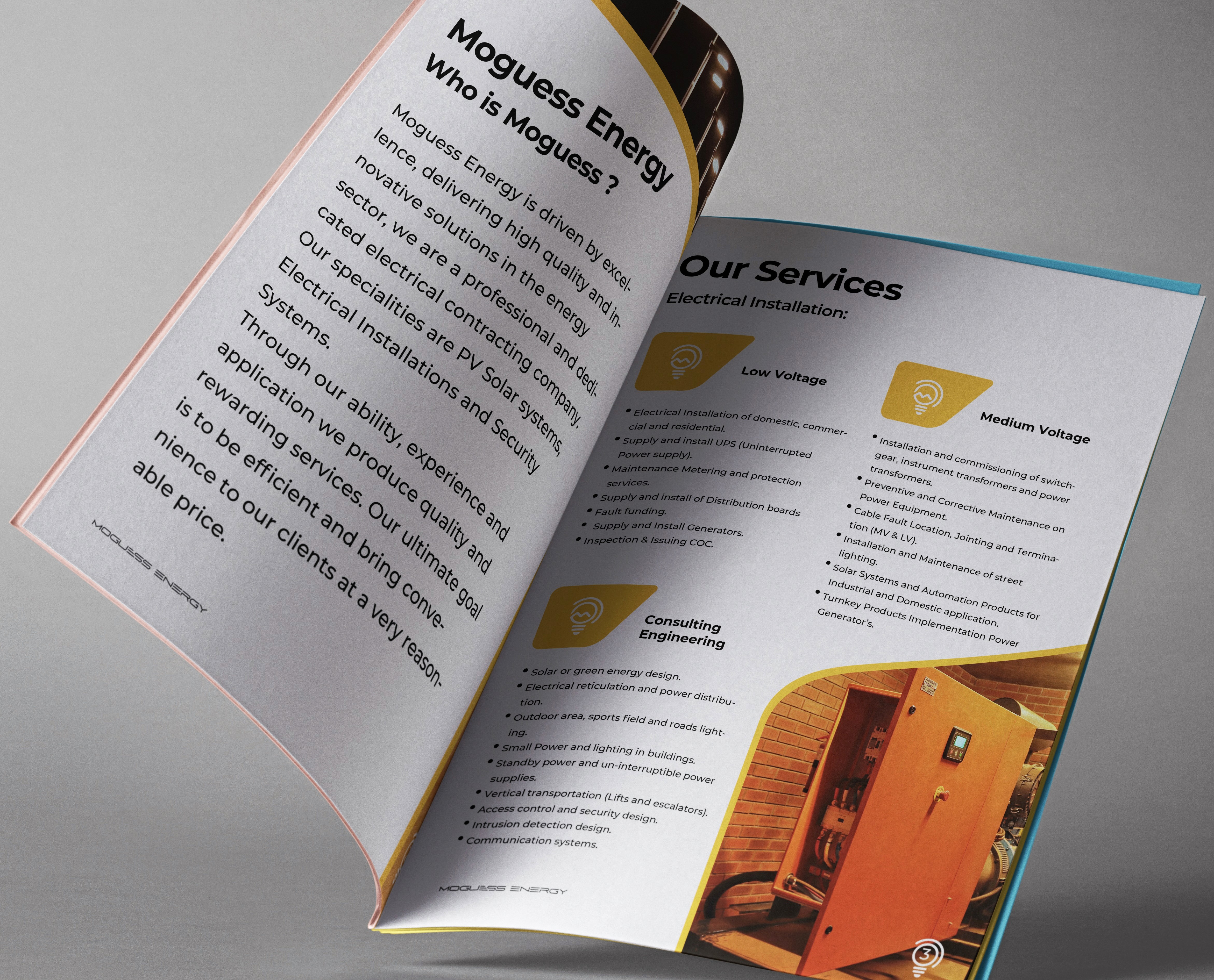
Company Profile:
The company profile is a ten-page document that provides an in-depth overview of Moguess Energy’s services, experience, and commitment to excellence. The document is designed with the following considerations:
Visual Hierarchy:
Each section of the profile is organized with bullet points and headings to create a visually appealing flow that guides the reader through the
Imagery: Relevant images of electrical installations and projects were incorporated to showcase the company’s work and add visual interest.
Typography & Colour: Consistent use of the brand's typography and colour palette
helps reinforce brand identity throughout the document.
Conclusion: The identity, logo, & stationery were developed to align with the company's vision of delivering innovative & efficient energy solutions. The final result is a brand identity that effectively communicates dedication to quality & customer satisfaction.