Creative Process & Development:
The journey began on paper literally. The initial logo was hand sketched using pencil on a traditional sketchpad, allowing for raw, instinctive creativity to shape the early direction. These sketches were refined over the course of two intensive weeks, involving deep exploration, revision, and collaborative feedback with the client. This analog to digital pipeline was essential in grounding the brand with authenticity while preparing it for a modern, digital first fashion audience.
The final logo design was vectorized in Adobe Illustrator, ensuring sharpness, scalability, and professional polish. To visualize the garments, Photoshop was used to create clean, on-brand apparel mockups, giving the designs a sense of realism and wearability.
Design Direction & Style:
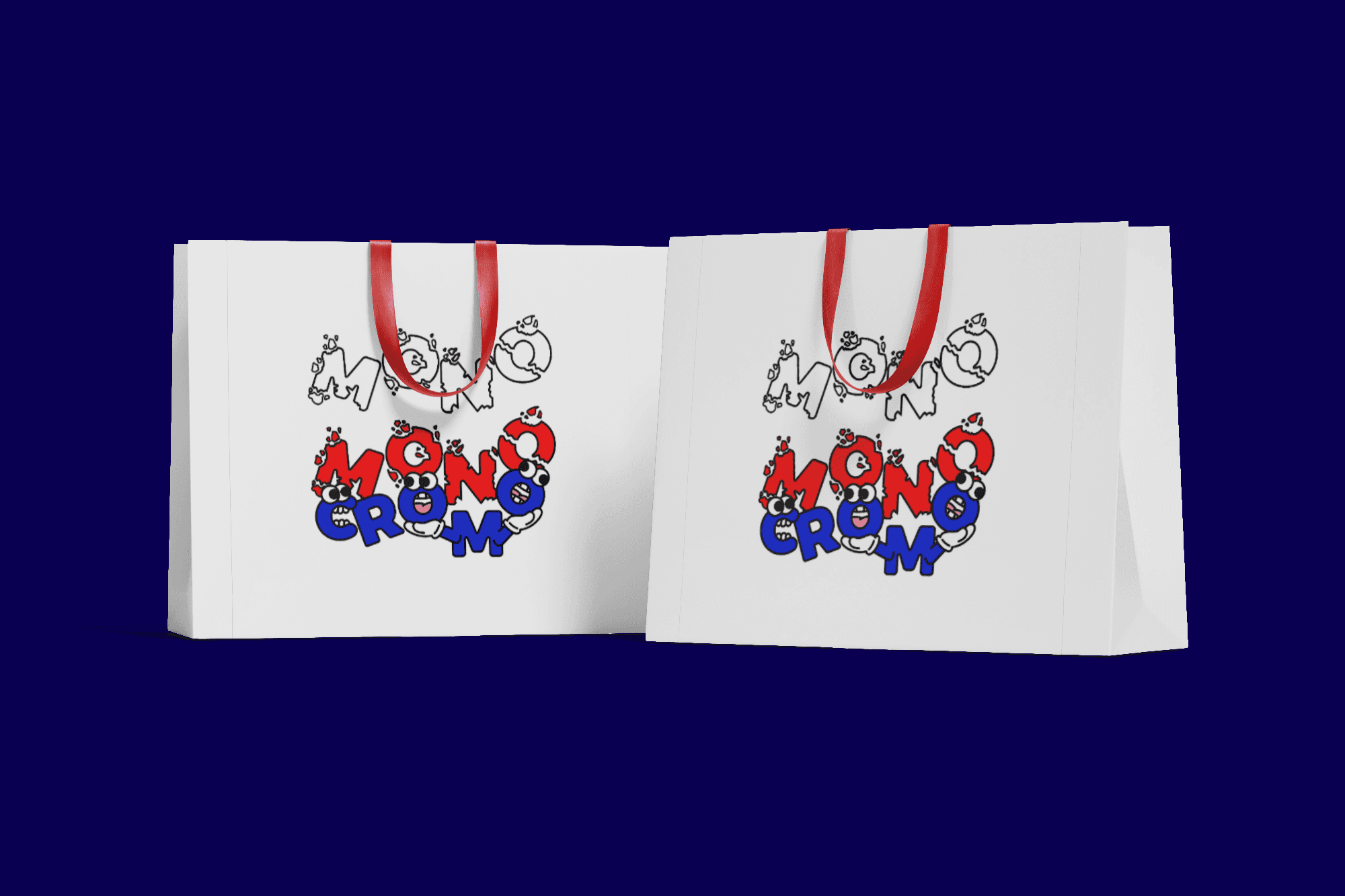
Monocromo is inspired by the visual universe that defines the "New Wave Company", a brand I also collaborated with through poster designs. That shared DNA is reflected in Monocromo’s cartoon style characters, chunky outlines, and playful deformation of typography, breathing life into the word itself. Each letter has personality animated with bold eyes, goofy expressions, and attitude turning the logo into a story of its own.
This graphic treatment speaks directly to a generation raised on meme culture, anime, retro cartoon aesthetics, and digital nostalgia.
Colour Palette & Symbolism:
The logo’s palette fuses classic red, blue, black, and white a nod to the clash between conformity and expression.
Red symbolizes power, energy, and creativity.
Blue introduces stability and groundedness.
Black and white provide contrast, clarity, and balance, allowing the coloured characters to pop even harder against clean, monochrome backgrounds.
This juxtaposition of colour against neutral space enhances the logo’s loud, rebellious character while keeping the garments wearable and versatile.