Creative Direction:
The direction for Offshore Studios centered on combining symbols of financial power with visual references to isolation and independence. This juxtaposition of a formal bank structure on a deserted island served as a metaphor for creative freedom and self sustained success. The tone is assertive, aspirational, and contemporary positioning the brand at the intersection of luxury, hustle, and authenticity.
Key Design Elements:
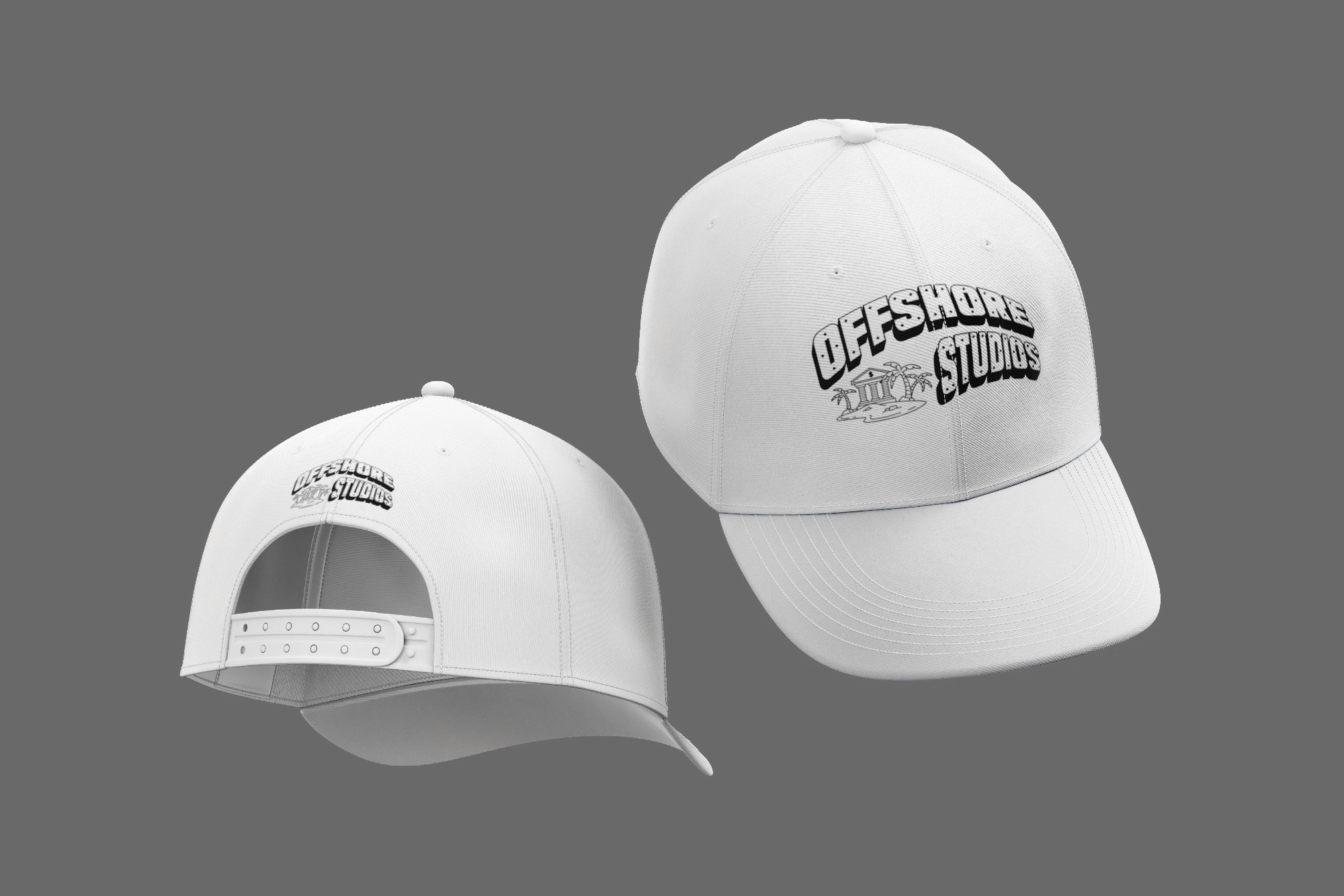
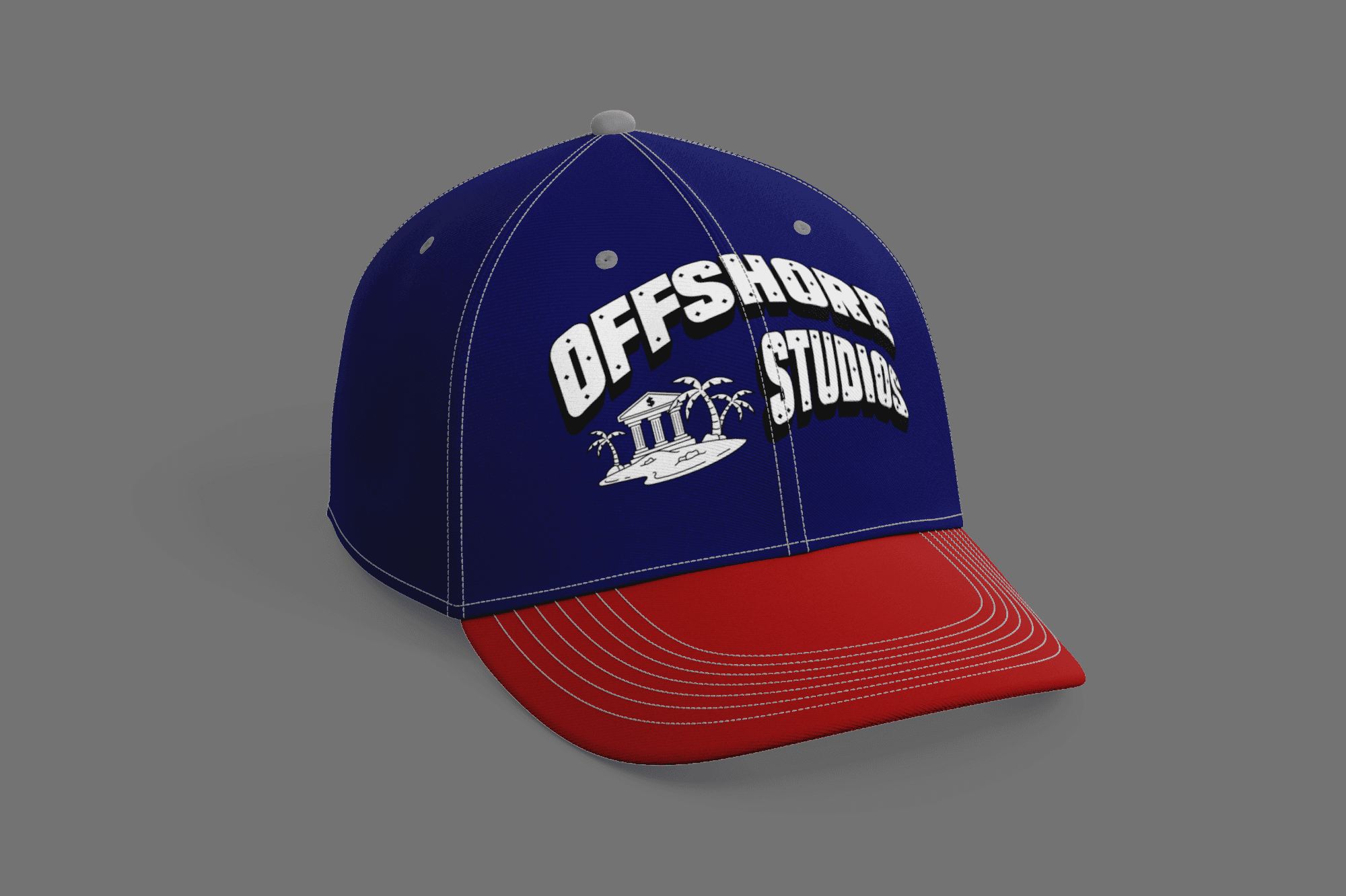
1. Logo Symbol
The main logo features a stylized bank placed on a small island, complete with palm trees, sand, and waves. This icon visually conveys the idea of an "offshore" location where wealth is protected and creativity operates independently. The building reflects financial institutions, while the island suggests escape and exclusivity.
2. Dollar Sign Motif
A prominent dollar sign appears on the front of the bank, reinforcing the central themes of prosperity and success.
3. Typography
The wordmark "OFFSHORE STUDIOS" is presented in a custom, bold sans serif typeface. The arched alignment gives the logo a sense of movement and structure, while diamond shaped cutouts within the letters add texture and visual interest suggesting value, security bolts, or gem facets.
4. Colour Scheme
A monochromatic black and white palette was chosen to ensure clarity and flexibility across all brand touchpoints. This high contrast combination enhances impact when used on clothing, digital content, and printed collateral.